23 Spring Family Photo Outfit Ideas 2026 That Look Chic & Timeless
Family photos are precious time capsules—images you’ll treasure for decades, pass down to future generations, and display proudly in your home. The pressure to coordinate everyone’s outfits while ensuring the photos look timeless rather than dated can feel overwhelming. Spring 2026 brings a refreshing approach to family photo styling that prioritizes cohesion over matching, comfort over stiffness, and authentic personality over forced perfection.
The key to successful family photo outfits is creating visual harmony without looking like you’re wearing uniforms. Think coordinated color palettes, complementary tones, and varied textures rather than identical outfits. These 23 family photo outfit ideas embrace the natural beauty of spring while ensuring your photos will look just as beautiful in twenty years as they do today. Whether you’re shooting in blooming gardens, urban settings, beaches, or your own backyard, these coordinated looks will help your family shine while letting individual personalities come through.
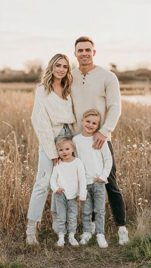
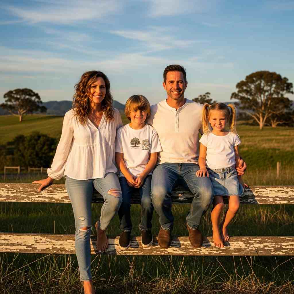
1. Neutral Layers with Denim
Mom in cream sweater and jeans, dad in beige henley and dark jeans, kids in white tees and denim creates casual coordinated ease.
Why it works: Neutrals and denim are timeless and universally flattering. The varied neutral tones create cohesion without being matchy-matchy, and everyone looks relaxed and natural.
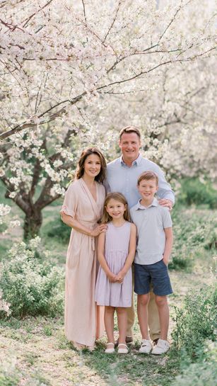
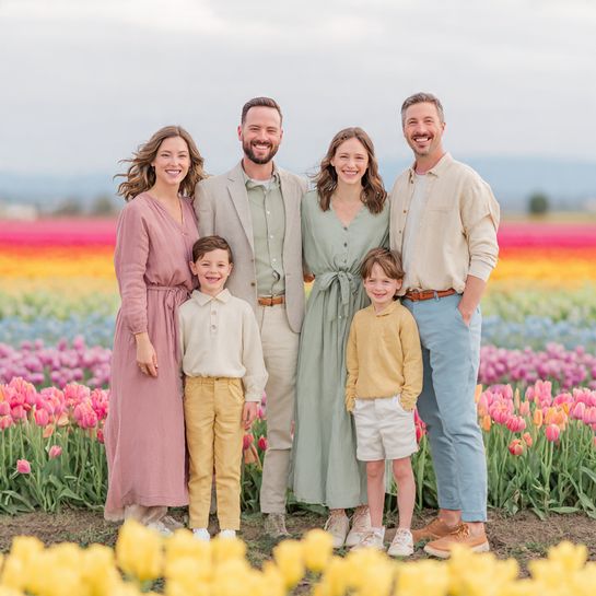
2. Soft Pastels in Garden Setting
Coordinated pastel palette—mom in blush dress, dad in light blue shirt, kids in lavender and mint creates spring garden harmony.
Why it works: Soft pastels photograph beautifully in spring settings and create a romantic, cohesive look. The varied colors add visual interest while maintaining harmony.
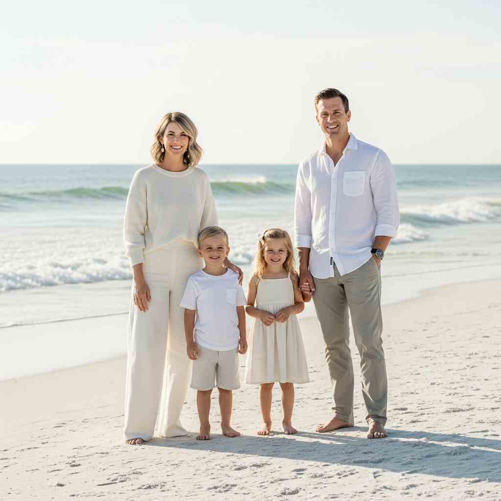
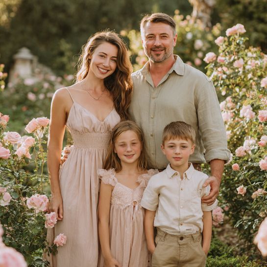
3. White and Cream Monochrome
Everyone in varying shades of white and cream—different textures and tones creates clean, elegant simplicity.
Why it works: All-white family photos are eternally classic and create a clean, cohesive aesthetic. The varied shades and textures prevent it from looking flat or sterile.
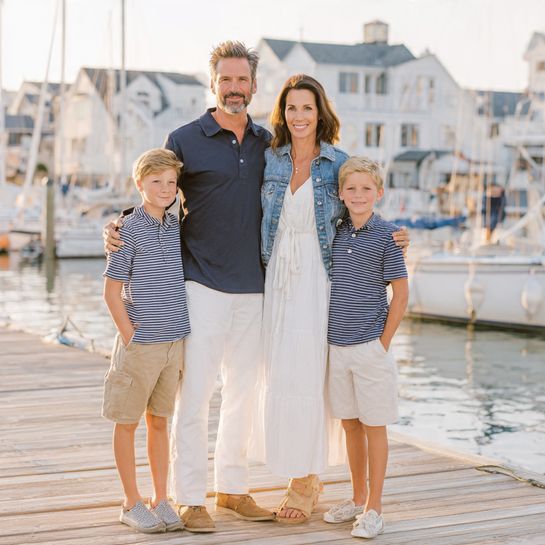
4. Navy and White Nautical
Navy and white palette—mom in white dress with denim jacket, dad in navy polo, kids in striped shirts creates classic nautical coordination.
Why it works: Navy and white is a timeless combination that photographs beautifully and works for all ages. It feels fresh and spring-appropriate without being trendy.
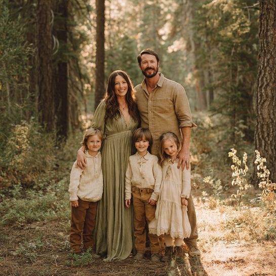
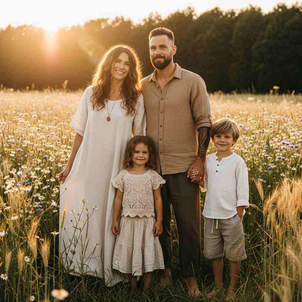
5. Earth Tones in Nature
Coordinated earth tones—browns, tans, olives, creams creates organic harmony with natural settings.
Why it works: Earth tones blend beautifully with outdoor settings while photographing richly. These colors are universally flattering and timelessly elegant.
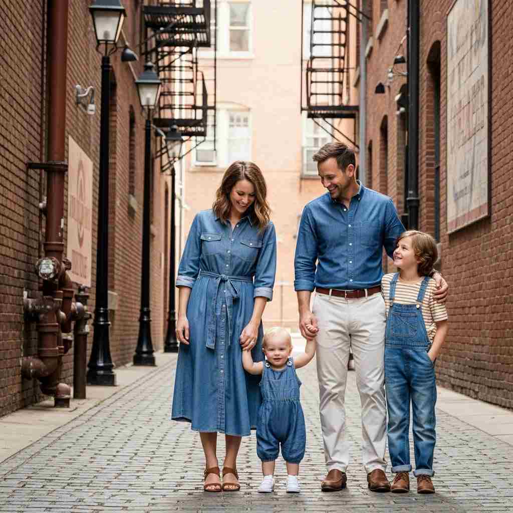
6. Denim with White Tops
Everyone in white or cream tops with different washes of denim creates simple coordinated casual style.
Why it works: This combination is fool-proof and timeless. The white tops unify the group while different denim washes add subtle variation.
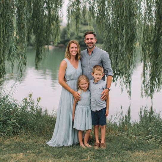
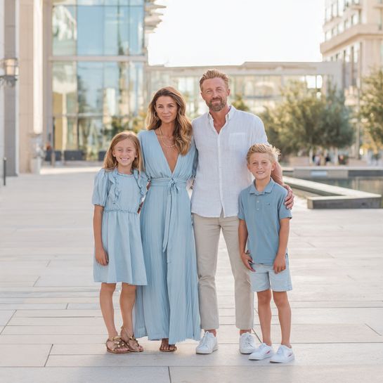
7. Soft Blues and Greys
Coordinated cool tones—mom in soft blue dress, dad in grey shirt, kids in coordinating blues creates serene harmony.
Why it works: Cool tones create calm, sophisticated photos and work beautifully for spring. The palette is modern yet timeless.
8. Floral Accents with Solids
Mom in floral dress with family in coordinating solid colors pulled from her dress creates pattern-centered coordination.
Why it works: The floral dress becomes the focal point while solid colors keep everyone coordinated without competing. This approach adds visual interest.

9. Chambray and Neutrals
Mix of chambray shirts with neutral bottoms and coordinating pieces creates casual sophisticated harmony.
Why it works: Chambray is universally flattering and timeless. Combined with neutrals, it creates a relaxed yet polished aesthetic.
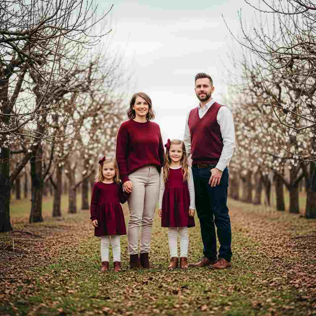
10. Burgundy and Cream Fall-Spring Transition
Rich burgundy and warm cream palette creates sophisticated seasonal transition coordination.
Why it works: These colors work beautifully for early spring when there’s still coolness in the air. The combination is rich and timeless.

11. Coordinated Patterns and Solids
Mixed patterns—one person in stripes, one in florals, others in coordinating solids creates dynamic visual interest.
Why it works: When patterns share a color palette, they create interest without chaos. The solid pieces ground the patterns beautifully.
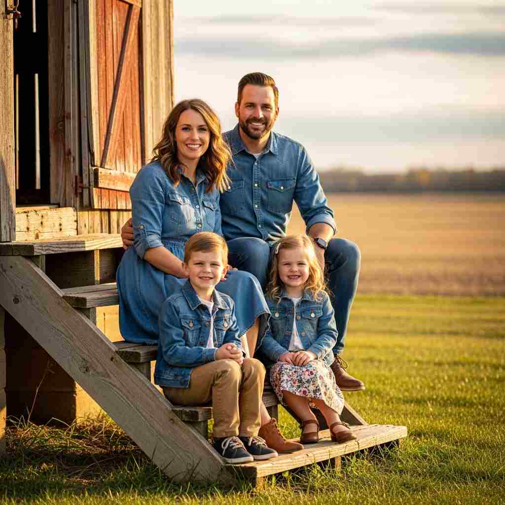
12. All Denim Casual
Everyone in denim-on-denim or varied denim pieces creates relaxed uniform coordination.
Why it works: Denim is timeless and the texture photographs beautifully. This approach feels casual and authentic while remaining coordinated.
13. Sage Green and Blush
Soft sage green and blush pink palette creates gentle spring romance.
Why it works: These colors are currently popular but classic enough to age well. They photograph beautifully in natural spring settings.
14. Tan and Navy Preppy
Classic tan and navy combination creates preppy timeless coordination.
Why it works: This color combination is eternally preppy and sophisticated. It works for all ages and photographs richly.

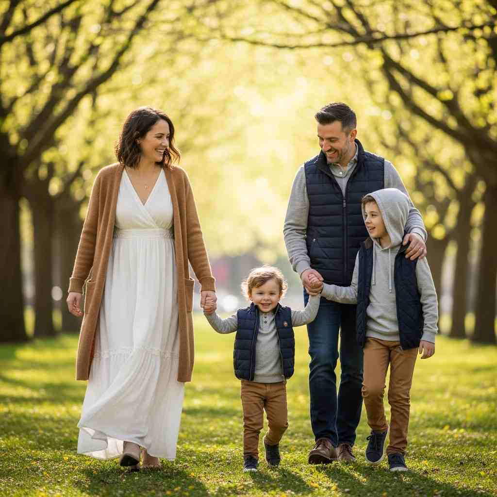
15. Coordinated Casual Layers
Everyone in layers—cardigans, jackets, vests over coordinating basics creates dimensional spring style.
Why it works: Layers add visual interest and texture while allowing for temperature comfort. The coordinated pieces tie everything together.
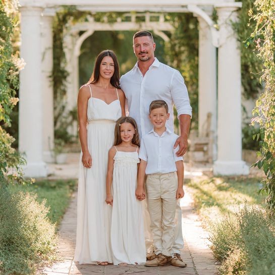
16. White Dresses and Khakis
Females in white dresses, males in khaki pants and coordinating shirts creates classic gender-coordinated style.
Why it works: This traditional approach is timeless and elegant. The white dresses photograph beautifully while khakis ground the men’s looks.
17. Muted Rainbow Coordination
Each family member in different muted color from the same tonal family creates subtle rainbow harmony.
Why it works: When colors are in the same tonal range (all muted or all bright), varied colors create interest without chaos.
18. Boho Neutrals and Textures
Flowing fabrics and textured neutrals—crochet, linen, knits in creams and tans creates bohemian coordination.
Why it works: The varied textures create interest while neutral colors maintain cohesion. This style feels relaxed and artistic.
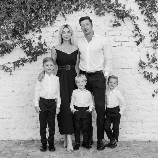
19. Black and White Classic
Timeless black and white palette creates graphic, elegant coordination.
Why it works: Black and white is eternally classic and creates striking, timeless photos. This combination never goes out of style.
20. Coordinated Dressy Casual
Mix of dressy and casual—mom in dress, dad in shirt and chinos, kids in coordinated casual-nice creates balanced formality.
Why it works: Not everyone needs the same level of formality. This approach feels natural while maintaining visual harmony.
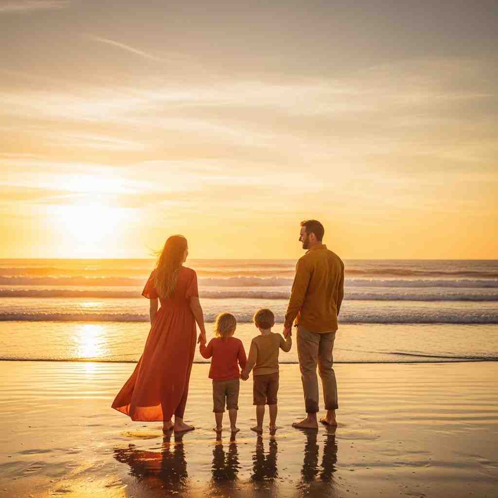
21. Sunset Warm Tones
Warm palette of oranges, yellows, and reds creates vibrant sunset-inspired coordination.
Why it works: Warm tones photograph beautifully in golden hour light and create energetic, joyful photos.
22. Garden Party Pastels with Patterns
Soft pastels with subtle patterns—gingham, small florals, dots creates spring garden party coordination.
Why it works: The patterns add personality while pastel tones keep everything cohesive and spring-appropriate.

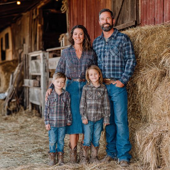
23. Rustic Country Coordination
Plaid, denim, boots, and earthy tones creates rustic country-inspired family coordination.
Why it works: This style works beautifully for rural settings and creates warm, authentic family photos with character.
Creating Timeless Family Memories
The most successful family photos in spring 2026 prioritize authentic connection over perfectly matched outfits. These 23 coordination ideas provide frameworks, but remember that the best photos capture genuine moments of love, laughter, and togetherness. Choose colors and styles that reflect your family’s personality while considering how they’ll photograph in your chosen location.
When planning your family photo outfits, start by selecting a color palette of 3-4 colors that work well together. Distribute these colors across family members in varied combinations rather than dressing everyone identically. Consider the setting—cool tones work beautifully near water, earth tones blend with forests, and bright colors pop against urban backgrounds.