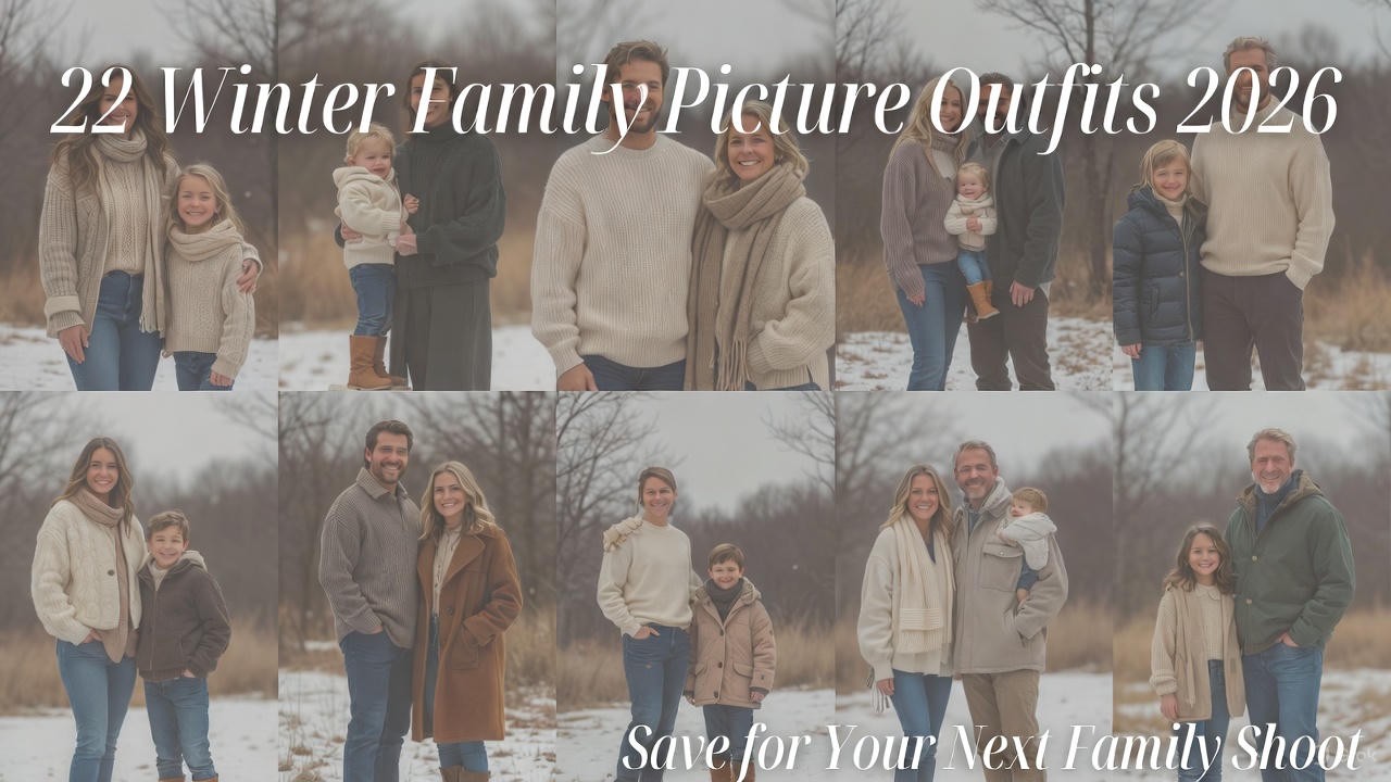
Winter family photos are about capturing warmth, connection, and the cozy beauty of the season and in 2026, coordinated family outfits have evolved beyond matching shirts into sophisticated, stylish ensembles that look natural rather than forced. The modern approach to family photo coordination focuses on color palettes and complementary styles rather than identical outfits, creating images that feel both cohesive and authentic. These coordinated looks work whether you’re shooting in a snow-covered park, against a rustic barn, in an urban setting, or at home by the fireplace. From classic neutrals to bold jewel tones, from casual cozy to dressed-up elegant, these 22 outfit ideas ensure your family looks coordinated, comfortable, and absolutely picture-perfect while still allowing each person’s personality to shine through.
1. Cream and Camel Neutrals
Everyone wears varying shades of cream, ivory, camel, and tan. Mom in a cream sweater dress, dad in a camel sweater and khaki pants, kids in ivory knits and tan pants. Soft, timeless, and incredibly flattering in winter light.
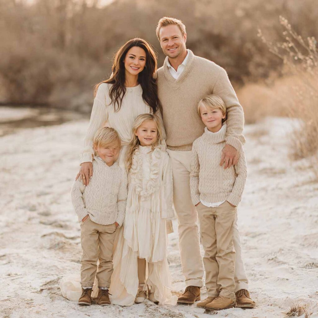
Why It Works: Cream and camel creates a soft, expensive-looking palette that photographs beautifully. These neutrals work on all skin tones and never look dated. The tonal variation keeps it interesting while maintaining cohesion.
2. Burgundy and Grey Sophistication
Deep burgundy paired with various shades of grey creates elegant coordination. Mom in a burgundy midi dress, dad in a grey sweater and dark jeans, kids in burgundy sweaters with grey pants. Rich and refined.
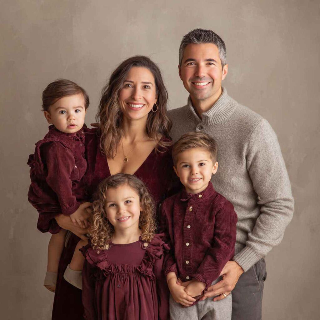
Why It Works: The combination of jewel-tone burgundy with neutral grey is sophisticated without being boring. Burgundy photographs as richly as red but feels more refined. Grey balances without competing.
3. Navy and Cream Classic
Timeless navy paired with cream creates nautical-inspired elegance. Mix navy sweaters, cream knits, navy pants, and cream dresses across family members. Add cognac leather accessories for warmth.
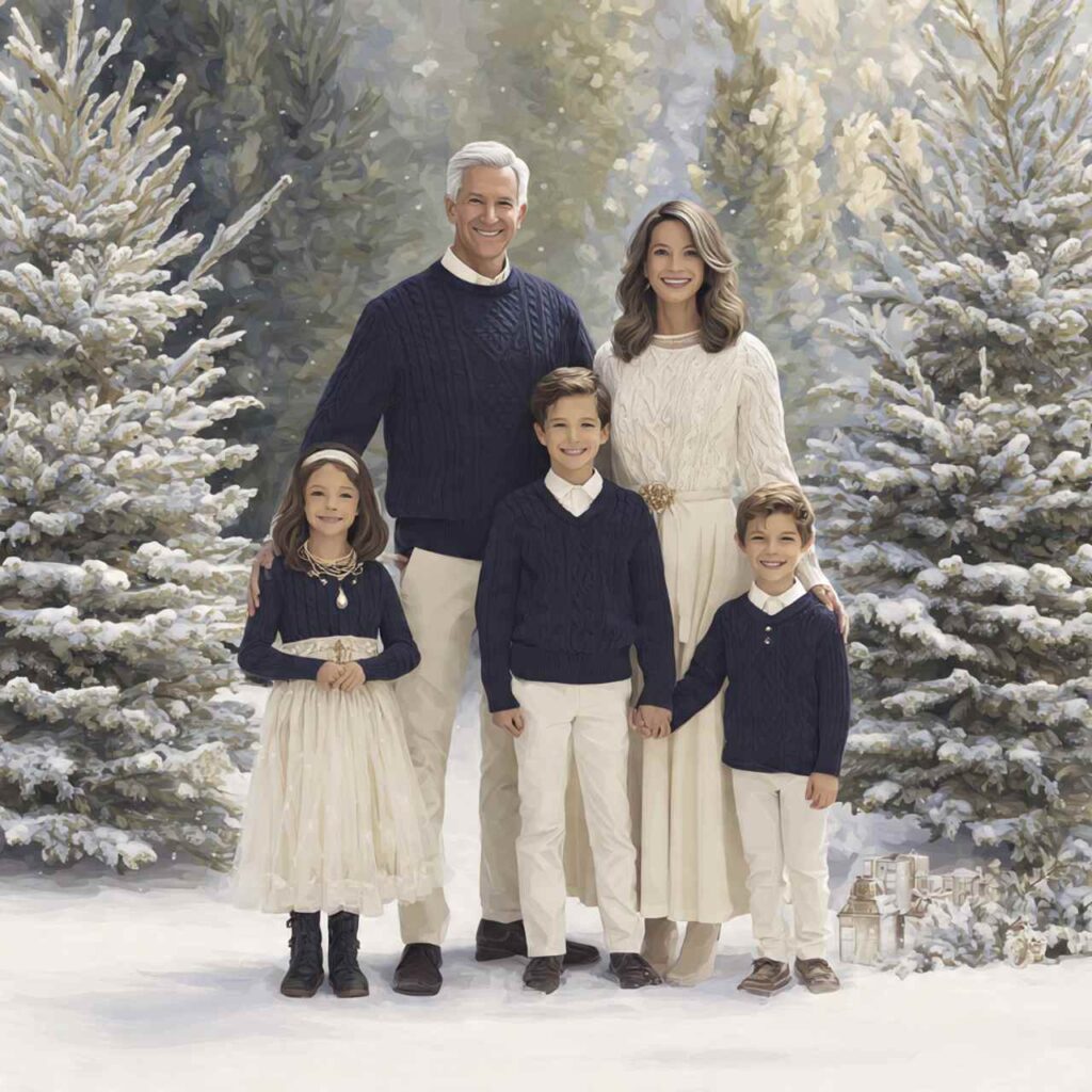
Why It Works: Navy and cream is foolproof it’s classic, appropriate for any setting, and flatters everyone. The contrast is strong enough to create definition in photos while remaining soft and wearable.
4. Forest Green Family
Everyone wears different shades of green forest, sage, olive, moss. The monochrome green approach with tonal variation creates cohesive natural beauty perfect for outdoor winter settings.
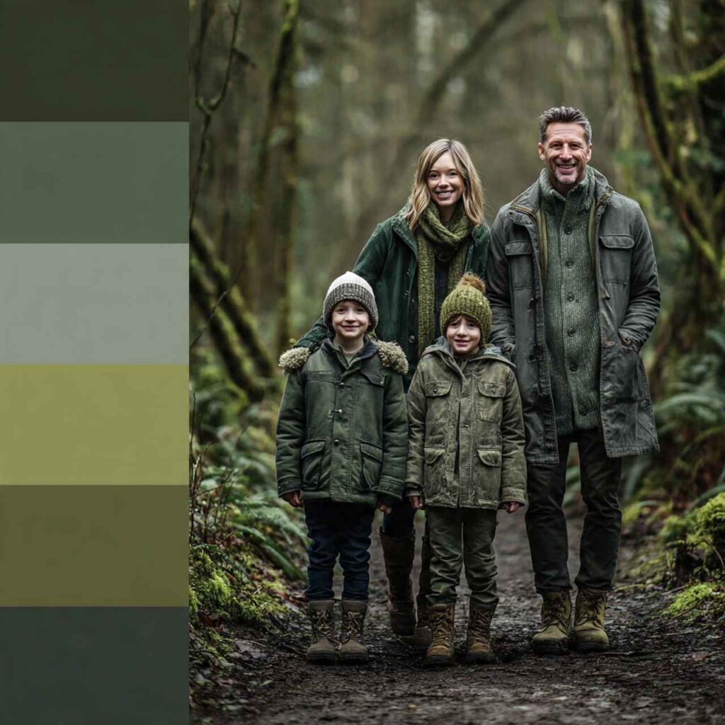
Why It Works: Monochrome dressing in green feels natural and organic, especially in outdoor settings. The variation in green shades keeps it visually interesting while maintaining strong coordination.
5. Black and Tan Contrast
Classic black paired with warm tan creates striking contrast. Adults in black sweaters and tan pants, or vice versa, kids mixing both colors. Add tan boots and accessories to tie it together.
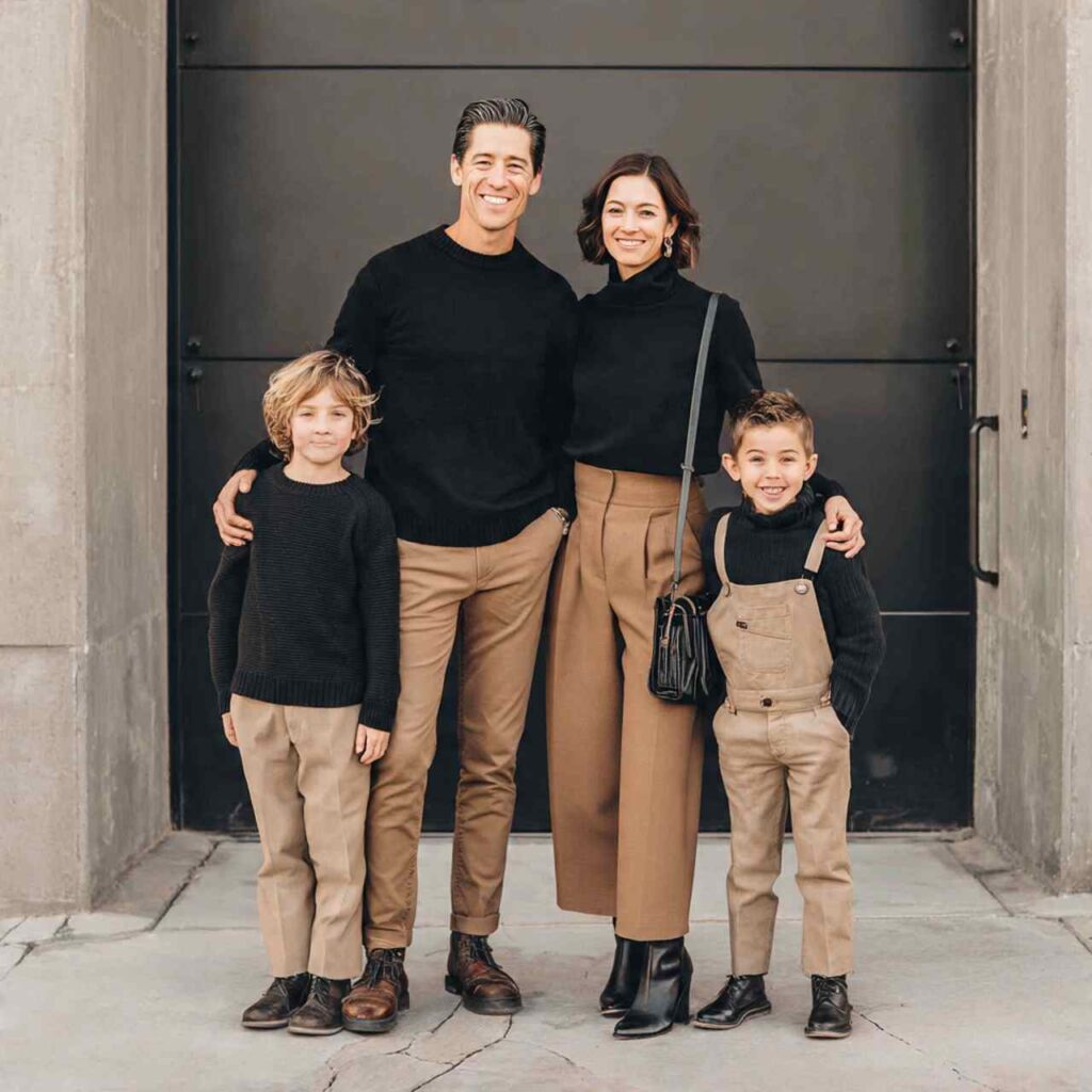
Why It Works: This combination is both modern and timeless. The high contrast creates visual impact while both colors are universally flattering and easy to find in winter wardrobes.
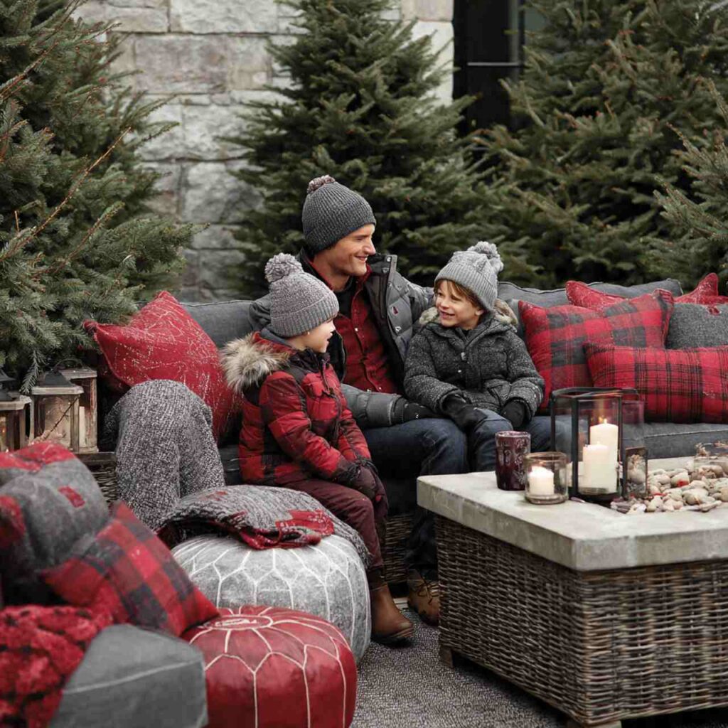
6. Plaid Incorporated
One or two family members wear coordinating plaid while others wear solid colors from the plaid pattern. Buffalo plaid flannel on dad, solid red on one child, black on another, creates cohesive pattern play.
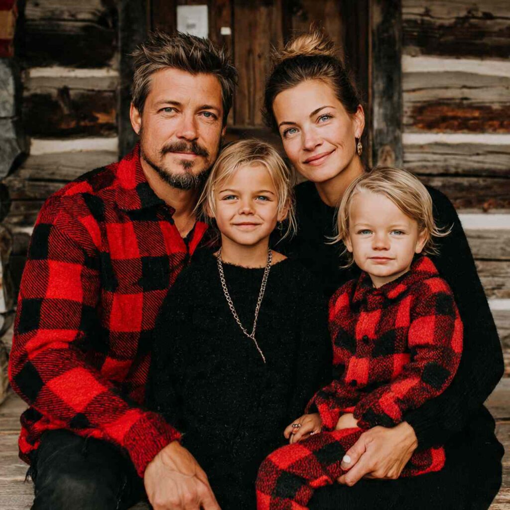
Why It Works: Plaid adds visual interest and winter coziness without everyone looking identical. Using the plaid’s colors as inspiration for solid pieces creates coordination that feels natural rather than forced.
7. Ivory and Gold Luxe
Creamy ivory paired with gold accents creates holiday luxury. Everyone in ivory sweaters or dresses with gold jewelry, gold shoes, or gold accessories. Soft metallics elevate the palette.
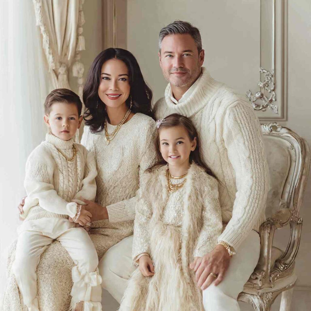
Why It Works: This combination feels festive and elegant without being costume-like. Ivory is softer than white, and gold adds just enough sparkle for holiday cards without being garish.
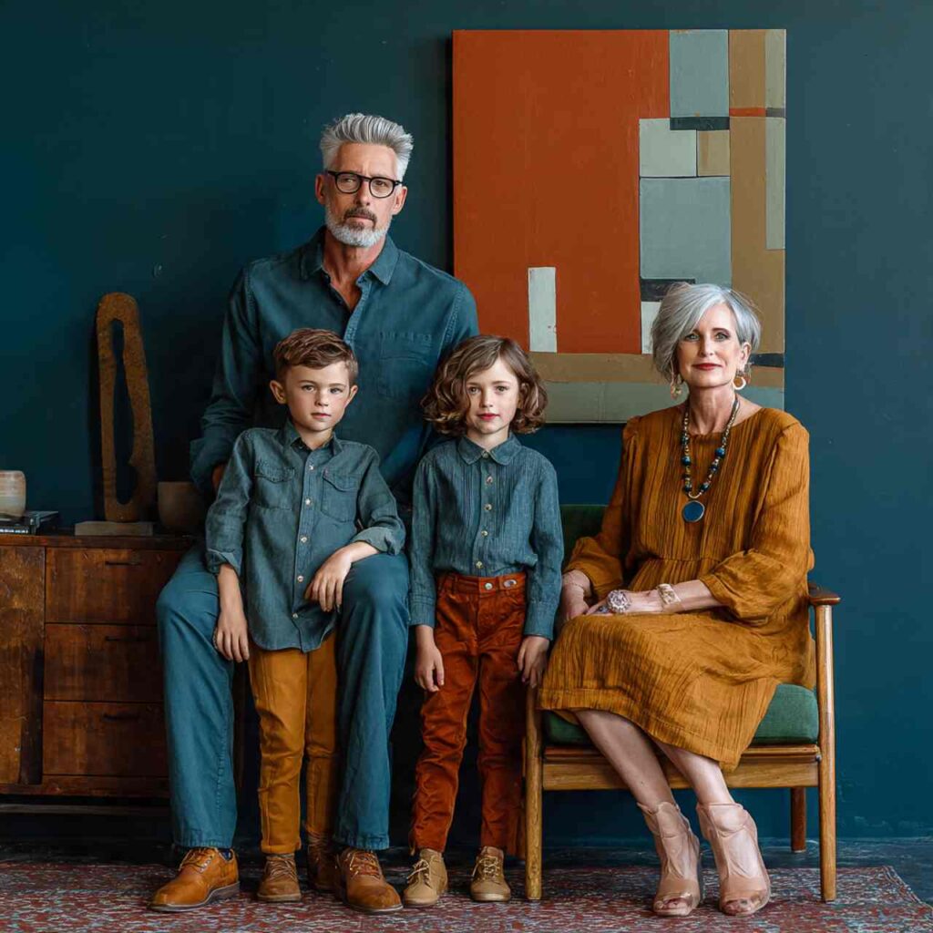
8. Earth Tone Spectrum
Terracotta, rust, caramel, chocolate, and cream all coordinate beautifully. Mix these warm earth tones across family members for natural, grounded coordination that photographs gorgeously.
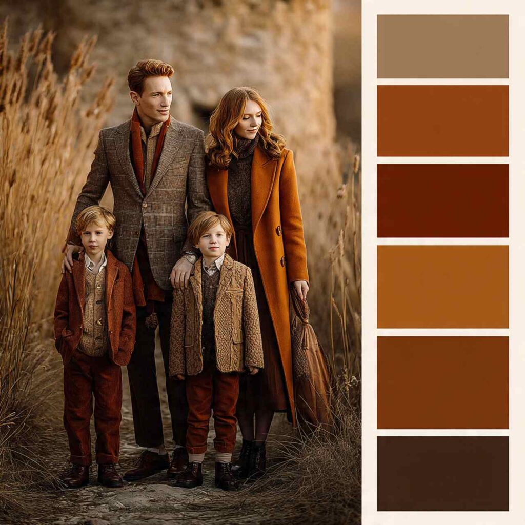
Why It Works: Earth tones feel organic and natural together, creating cohesion without rigidity. These warm colors photograph beautifully and work in various outdoor settings from fields to forests.
9. Denim and White Simplicity
Everyone wears denim bottoms (jeans, denim skirts) with white or cream tops. The uniformity of denim creates coordination while white tops keep it fresh and clean. Add tan accessories.
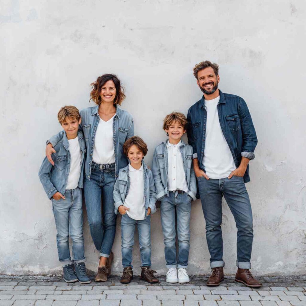
Why It Works: This is the easiest coordination to pull off most families already own these pieces. It’s casual, approachable, and works for families who want coordination without buying all new clothes.
10. Charcoal and Blush Softness
Cool charcoal grey paired with soft blush pink creates modern romantic coordination. Mix these colors across family members with some in charcoal sweaters, others in blush, balanced throughout.
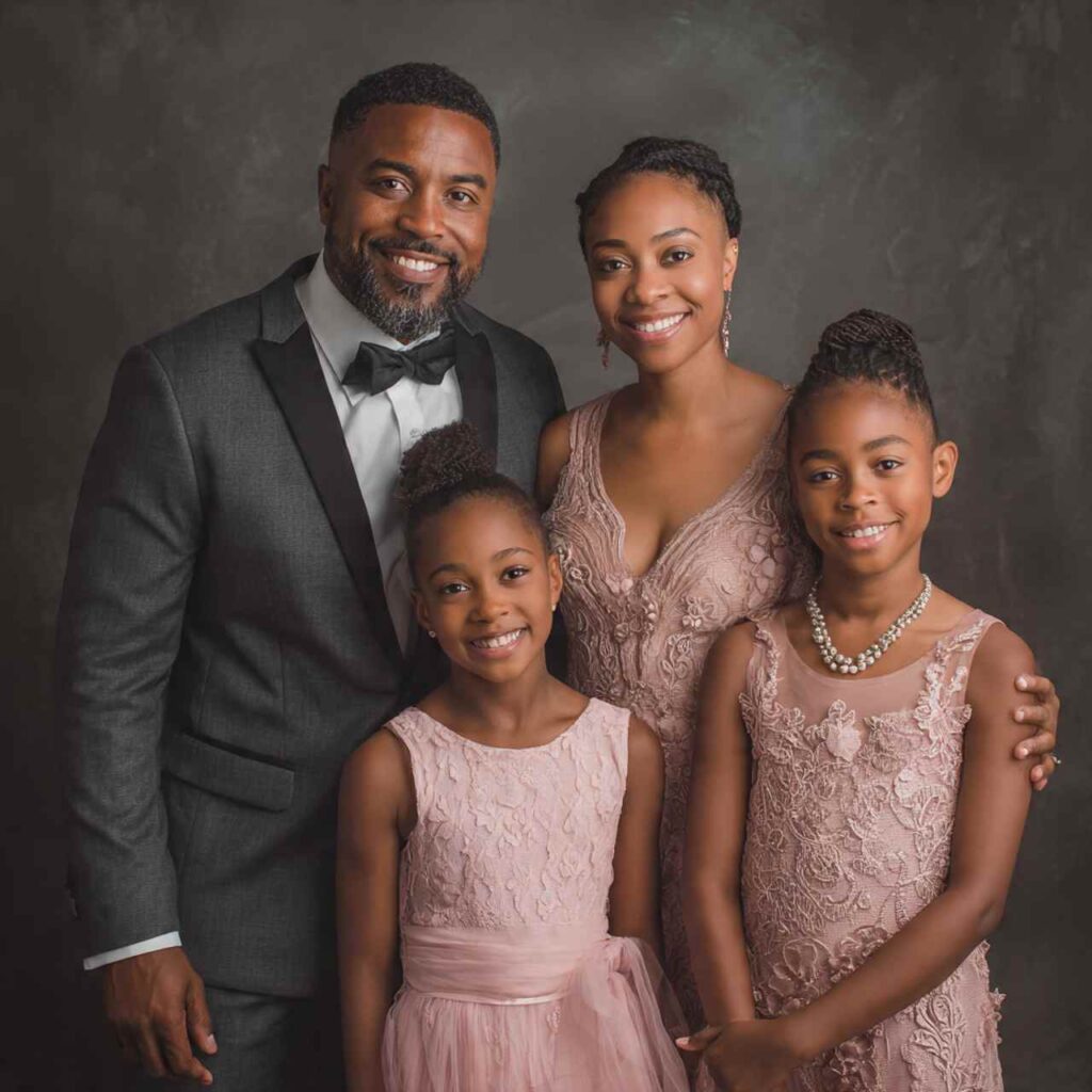
Why It Works: This combination is sophisticated and current. The charcoal provides grounding while blush adds softness. It works beautifully for families with daughters but isn’t overly feminine.
11. Cable Knit Texture Theme
Focus on texture rather than color everyone in cable knit sweaters in coordinating neutrals (cream, grey, tan). The uniform texture creates cohesion while colors can vary within the neutral palette.
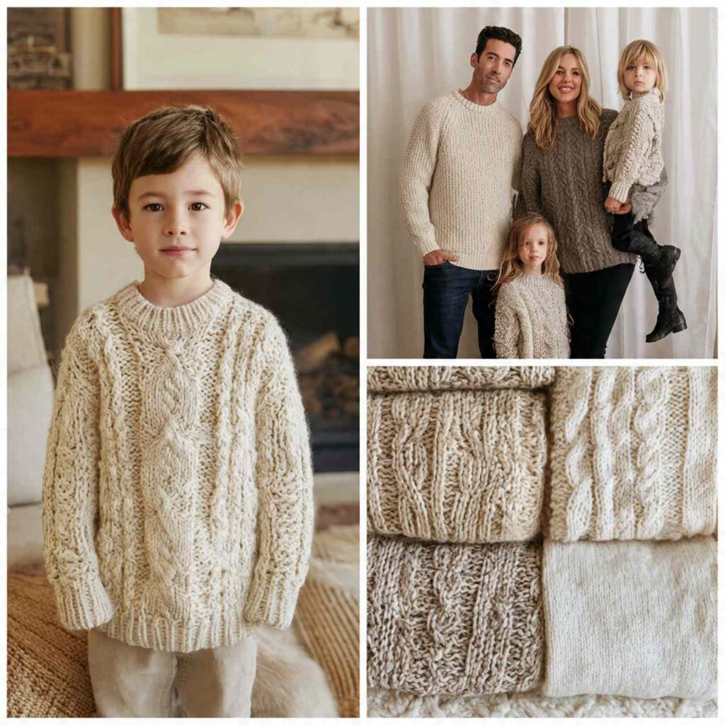
Why It Works: Texture-based coordination is sophisticated and allows more flexibility in color choice. Cable knits are inherently winter-appropriate and photograph beautifully with their dimensional texture.
12. Jewel Tone Richness
Mix jewel tones—emerald, sapphire, ruby, amethyst—across family members. The richness and saturation create cohesion even though colors differ. Best for evening or indoor shoots with good lighting.
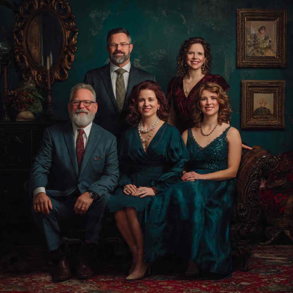
Why It Works: Jewel tones have similar saturation and richness, so they coordinate beautifully even when different. They photograph with depth and vibrancy, perfect for holiday cards.
13. Rustic Flannel and Denim
Mixing flannel patterns in coordinating colors with denim creates casual winter warmth. Dad in plaid flannel, mom in solid color from the plaid, kids in coordinating flannels and denim.
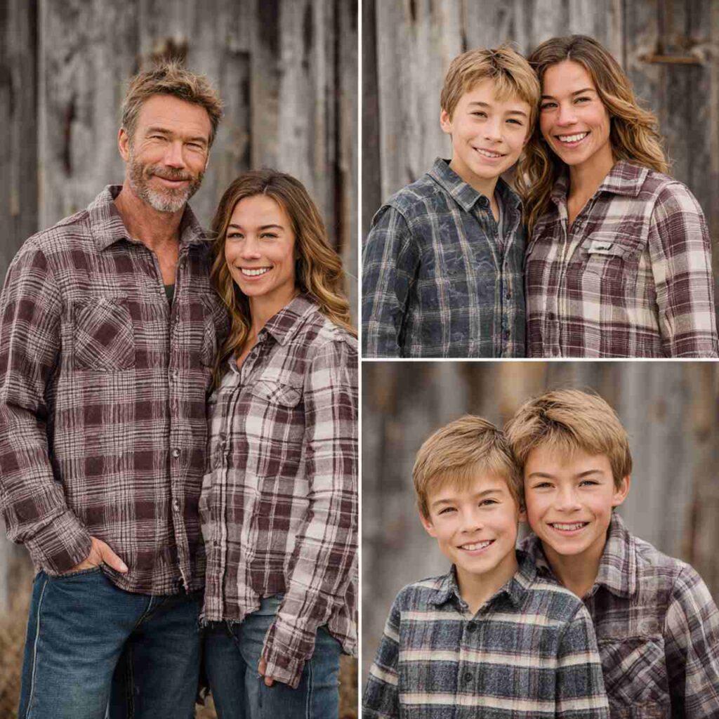
Why It Works: This look is perfect for outdoor, rustic settings. It’s casual and comfortable while looking intentionally coordinated. The flannel patterns add visual interest.
14. Monochrome Black Elegance
Everyone in black creates dramatic, elegant coordination. Mix textures—knits, dresses, pants, sweaters—all in black for sophisticated simplicity. Add one gold or silver accessory per person.
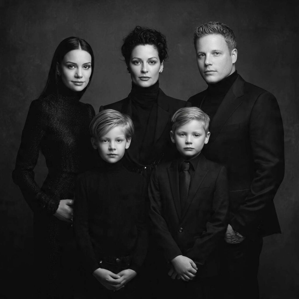
Why It Works: All-black is timelessly elegant and incredibly slimming. It puts the focus on faces and family connection rather than clothing. Works in any setting and never goes out of style.
15. Sage and Taupe Serenity
Soft sage green paired with warm taupe creates calm, natural coordination. These muted earth tones work beautifully together and photograph with soft, flattering light.
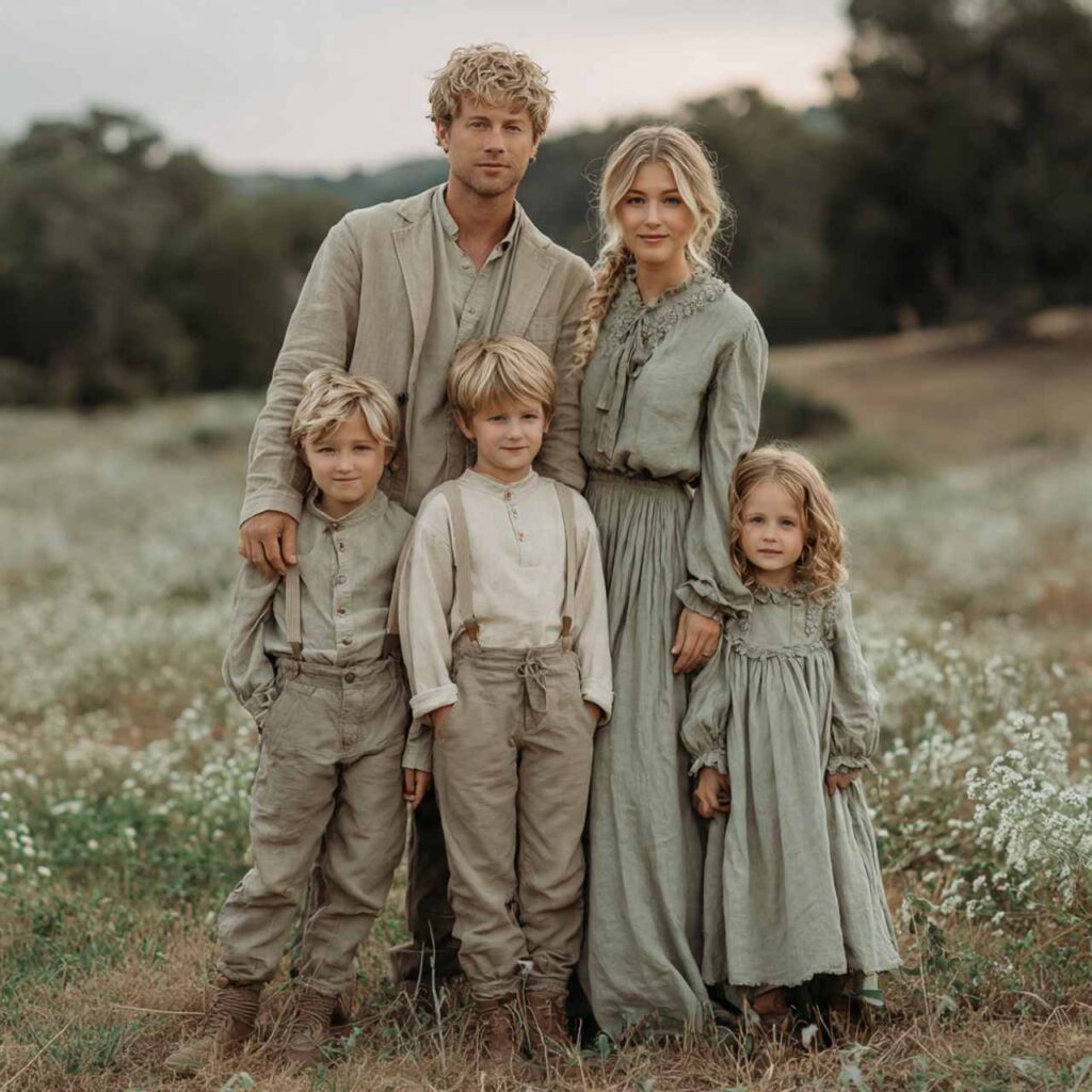
Why It Works: Both colors are muted and sophisticated, creating subtle coordination that feels natural. They’re universally flattering and work in outdoor settings without competing with nature.
16. Winter White and Silver
All white or cream with silver metallic accessories creates winter wonderland elegance. Perfect for snowy settings or formal holiday portraits.
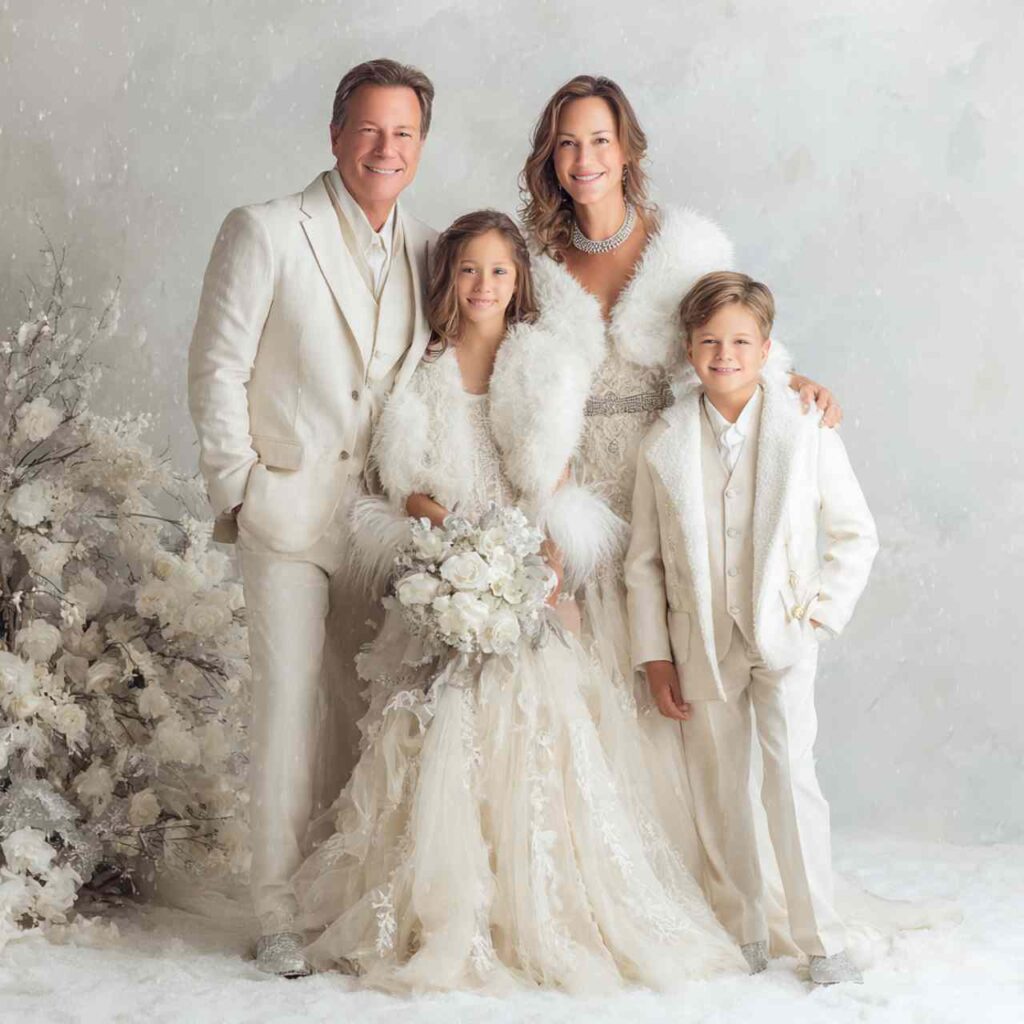
Why It Works: White-on-white creates ethereal, winter-perfect images. Silver accessories add just enough sparkle. This works especially well for Christmas cards or winter wedding family photos.
17. Camel, Navy, and Cream Mix
Three-color palette distributed across family—some in camel sweaters, some in navy, some in cream, but everyone incorporates all three colors. Rich, classic, and versatile.
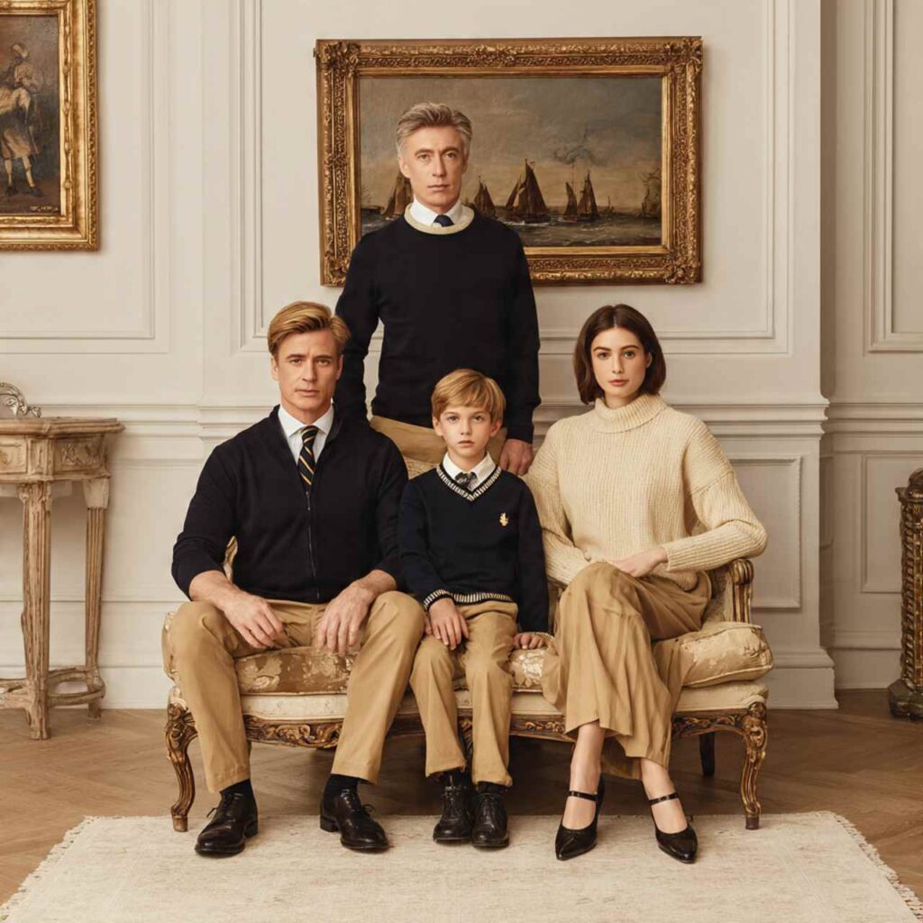
Why It Works: Three-color palettes create rich coordination with built-in variety. These specific colors are classic and work in any setting, giving families options while maintaining cohesion.
18. Red and Grey Holiday Classic
Classic red paired with charcoal grey creates holiday coordination without being Christmas costume-like. Mix red sweaters with grey pants, grey sweaters with red accessories.
Why It Works: Red says “holiday” without being overly Christmas-themed. Grey grounds the red and prevents it from being too bright. Perfect for holiday cards that aren’t overly thematic.
19. Layered Neutrals with Texture
Everyone in neutrals (cream, tan, grey, brown) but with varied textures and layers—knit cardigans, denim jackets, scarves, vests. The layering creates visual interest within neutral coordination.
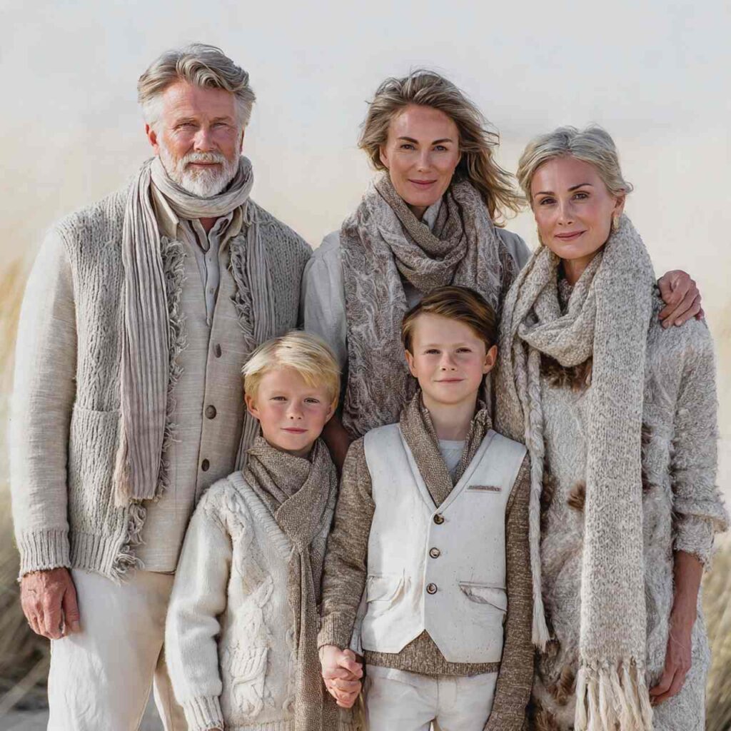
Why It Works: Layers add dimension to photos and create visual interest within a simple palette. This approach works well in outdoor settings where natural layering for warmth becomes part of the aesthetic.
20. Teal and Rust Unexpected
Teal blue paired with rust orange creates unexpected coordination that’s both modern and natural. These complementary colors create visual impact while feeling organic together.
Why It Works: This combination is fashion-forward and creates stunning contrast. The colors complement each other on the color wheel and create images that stand out from typical family photos.
21. Brown Tones Spectrum
From light tan through caramel, chocolate, to deep espresso—everyone in different shades of brown creates monochrome sophistication. The variation prevents it from being flat while maintaining cohesion.
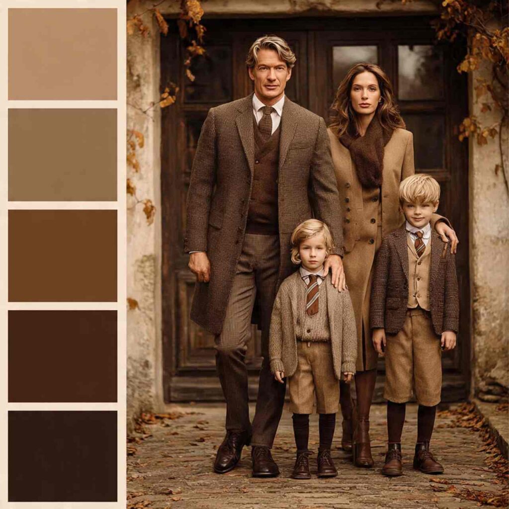
Why It Works: Brown monochrome is rich and sophisticated. The tonal variation creates dimension while the color family unity creates strong coordination. Very on-trend for 2026.
22. Dusty Blue and Cream Romance
Soft dusty blue paired with cream creates romantic, timeless coordination. Mix dusty blue sweaters, dresses, and shirts with cream pants and accessories for balanced distribution.

Why It Works: Dusty blue is universally flattering and photographs beautifully. Paired with cream, it creates soft contrast that’s romantic without being overly sweet. Perfect for timeless family portraits.
Modern Family Photo Coordination Principles
The Evolution of Matching: 2026 coordination focuses on:
- Color palettes rather than identical outfits
- Complementary styles not uniform looks
- Individual personality within cohesive group
- Natural coordination that doesn’t look forced
What Doesn’t Work Anymore:
- Everyone in identical shirts
- Overly themed costumes
- Neon or extremely bright colors
- Busy patterns on everyone
- Stiff, formal matching
Planning Your Coordinated Look
Start with One Piece: Choose mom’s outfit first (traditionally the most important), then build everyone else’s looks around her colors and style.
Distribution Strategy:
- If mom wears two colors, distribute them across other family members
- Don’t put all dark colors on one side of the family
- Balance the palette throughout the group
- Allow each person to have one “hero” color
Consider Your Setting:
- Outdoor winter: Layers, cozy knits, boots
- Indoor studio: Can be more dressed up, formal
- At home: Casual, comfortable, natural
- Urban: Modern, sleek, contemporary
- Rural/rustic: Flannels, denim, casual
Shopping Strategy for Coordinated Outfits
What to Buy New:
- Statement pieces for mom (she’s often the focal point)
- Pieces you don’t already own in the palette
- Quality items you’ll wear again
What to Use from Closets:
- Jeans and denim (most families own these)
- Neutral sweaters
- Boots and shoes
- Layering pieces
Budget-Friendly Approach:
- Start with what you have
- Buy only missing pieces
- Choose styles you’ll wear beyond the photo session
- Consider borrowing or swapping with friends
Timing: Shop at least 2-3 weeks before photos to allow for exchanges or alterations if needed.